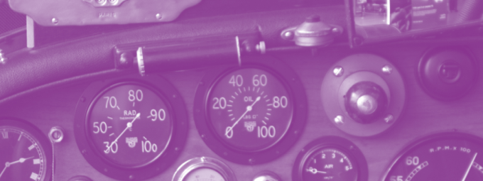
 While at the San Francisco Auto Show last year, I wondered why car dashboards were so wrong? Every car — regardless of category or price — had the same mess of dials, buttons, lights and screens surrounding the driver. While there were unique and compelling exterior designs, dashboards were all similarly bad. Read More
Source: TechCrunch